Intro
Typography is our visual voice. Bringing range, nuance and attitude to what we have to say.
A typographic system
Typography is a key element of our brand. It works to maintain consistency, create clarity and provide equity to the athenahealth brand.
Our typographic system utilizes two typefaces, Source Sans 3 and PT Serif, that help bring a consistent visual tone to all applications.
Hierarchy specifications
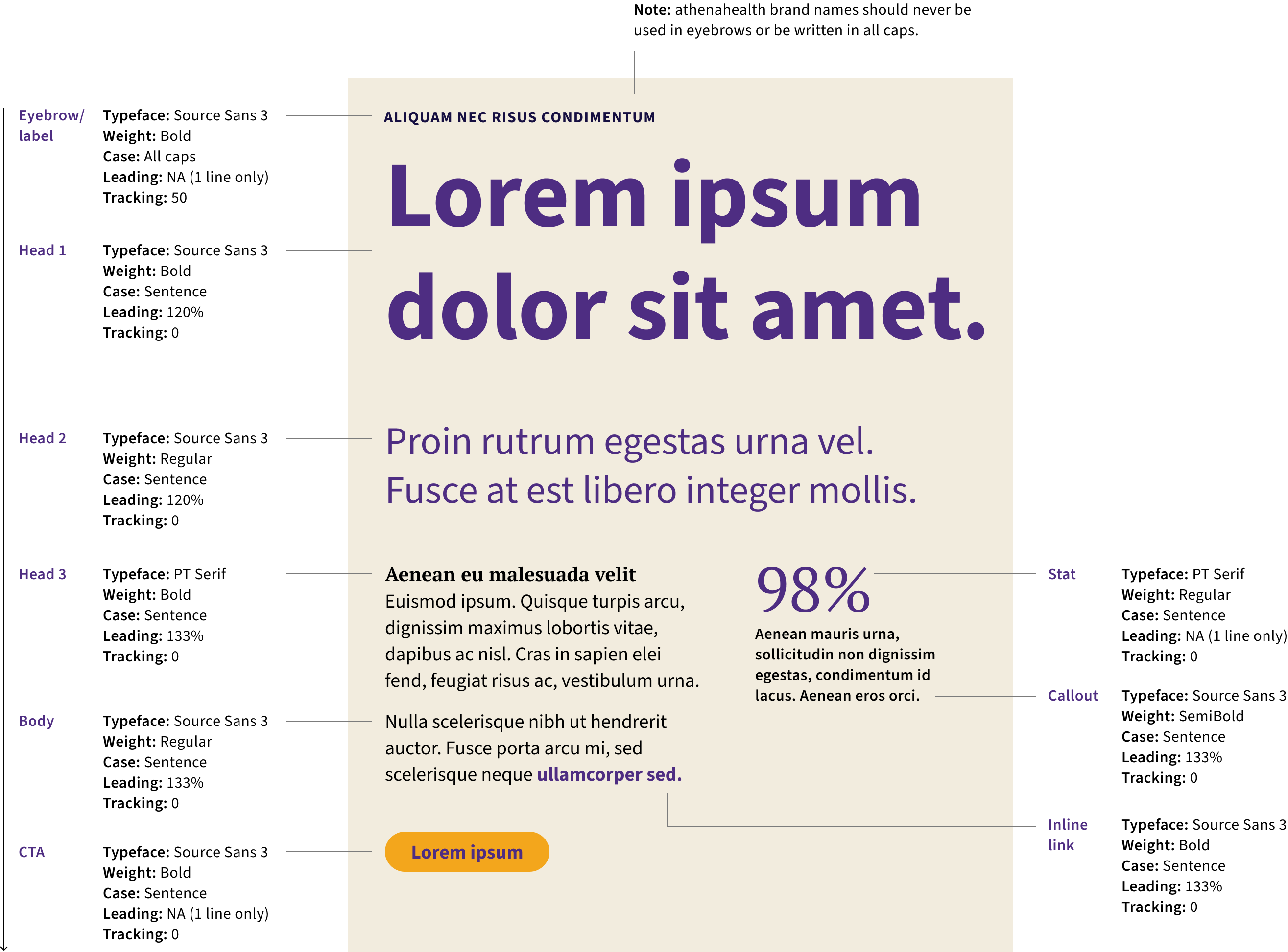
Establishing a strong hierarchy is one of the most important aspects of communicating with type. The styling and placement of all elements — both type and images — should clearly guide the viewer through the content in order of importance.
The specifications shown here describe how typography should be treated in a descending order as follows: Eyebrow/label > Head 1 > Head 2 > Head 3, Body > CTA. Stat, Callout and Inline link live outside of this order and should be used as needed. Left justify all text, with exception of CTAs.

Using the type hierarchy
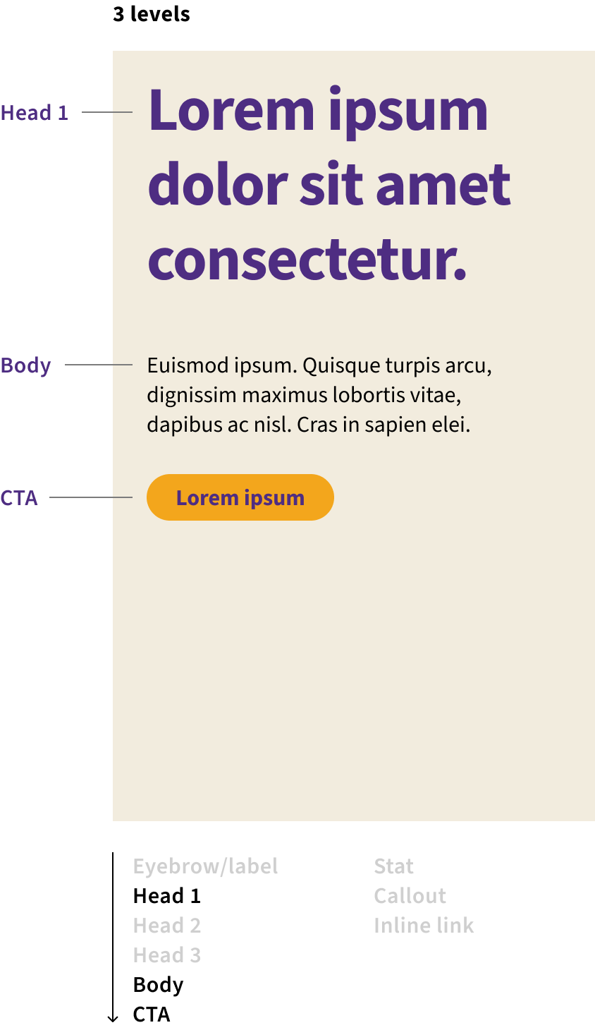
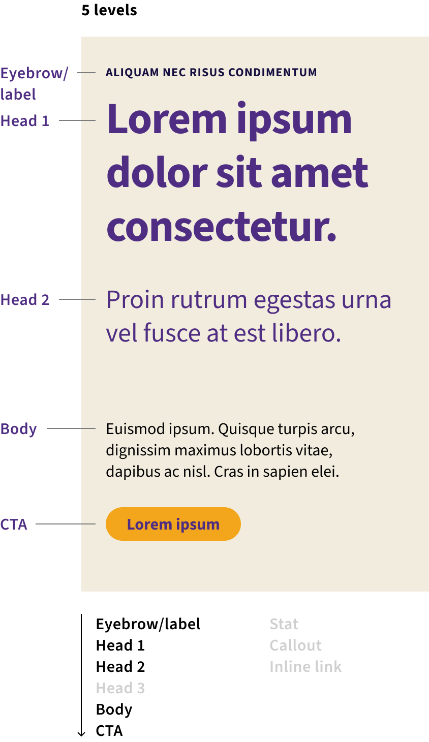
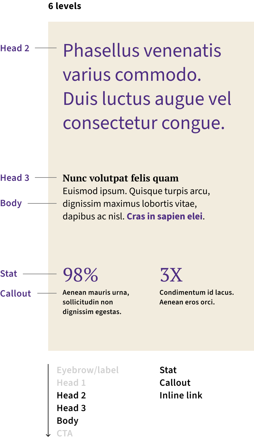
When using the typefaces as outlined on the previous page, it's important to note that all levels of the hierarchy will not always be needed. A brief banner ad may only use 2 or 3 levels, while a case study may use every level. The examples shown here illustrate type combinations that are possible and how they reflect our hierarchy specifications.


Sizing
Print and digital sizes for the minimum/maximum size of each typeface are shown here.
An important note in our typographic usage is that our headlines typefaces, Head 1 & 2, are intended to be used large. Conversely, Head 3, is intended to be used at smaller sizes.
Head 1
Head 1 (Source Sans 3 Bold) should be used large, at a minimum of 22 px or 26 points.
Head 2
Head 2 (Source Sans 3 Regular) should be used large, at a minimum of 22 px or 26 points.
Head 3
Head 3 (PT Serif Regular) should be used at smaller sizes, with a maximum of 20 px or 24 points.
Eyebrow/label, Inline link
Eyebrows & inline links (Source Sans 3 Bold) should be used at smaller sizes, with a maximum of 20 px or 24 points.
Body
Body copy (Source Sans 3 Regular) should be used at smaller sizes, with a maximum of 20 px or 24 points.
Callout
Callouts (Source Sans 3 SemiBold) should be used at smaller sizes, with a maximum of 20 px or 24 points.