Intro
Photography is how we visually bring our brand story to life and establish an emotional connection with our audience.
Our photography
Approachable and inviting, our photography authentically and simply captures the people we serve -from independent practices, health systems and payers-to patients, partners and athenistas.
Our photography style
In the room where it happens
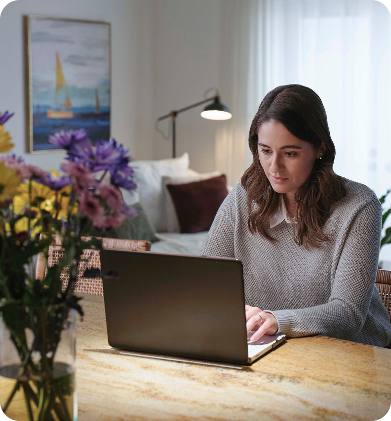
'In the room where it happens' is our overarching photography style. This means our photography should have a photojournalism quality to it; capturing authentic moments of care and connection that feel genuine and relatable —candid moments with an emphasis on the details of that scene, such as the touch of a doctors hand.
Remember, actual care and connection can sometimes be messy and emotionally heavy, our photography should reflect that. This doesn't mean our photography should feel depressing or sad but it should reflect reality, not stock photography (e.g. overly staged, dramatized, fake, etc.).
This is achieved by utilizing thoughtful camera compositions, such as shooting over the shoulder of our subject or incorporating foreground elements from within the space. These techniques help immerse the viewer, making the imagery feel dynamic and grounded in reality.

Categories



Principles
Principles to make our photography feel distinctly ours
Simple: Our brand stands for simplicity and that should come through in our photography. That means the central focus of our imagery should be on the care and connection depicted. Following the principles outlined here will help ensure that we are capturing simple yet powerful images that resonate with our audience and reinforce how we're curing complexity to simplify the practice of care.
Authentic: Use images that feel realistic and capture genuine moments of care and connection across the healthcare ecosystem. Avoid images that feel staged, stock-like, or are overly conceptual.
Natural: Our images should feel natural and match what we would encounter in the real world. Avoid images where people or settings appear overly photoshopped or altered in ways that are unrealistic or unrelatable.
Care and connection: Use images that focus on the interaction between subjects, utilizing body language like eye contact and touch. Avoid images where subjects feel posed or have unrealistic facial expressions.
Diverse: Intentionally showing diversity across identity dimensions in our imagery is an important way to showcase and amplify our vision to create a thriving, ecosystem that delivers accessible, high-quality, and sustainable healthcare for all. For guidance on how to achieve this principle review the Diversity and Inclusion section further down this page.
Medical accuracy: Ensure medical props, wardrobes and backgrounds are accurate and represent realistic medical scenarios. If you're unsure, consult with your product or campaign strategist or a member of the brand team.
Composition: Our images should have a clear focal point and use thoughtful camera compositions to achieve our principle of 'in the room where it happens', such as shooting over the shoulder of our subject or incorporating foreground elements from within the space. This will also help our images feel proprietary.
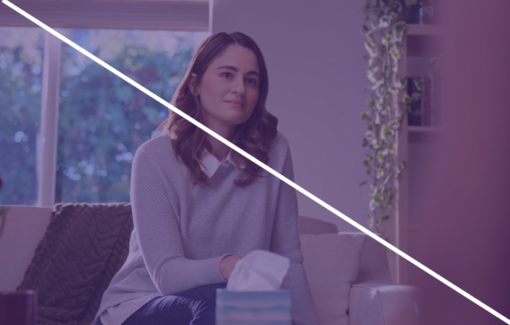
Expression: Our photography should capture the full range of emotions that our audiences experience from serious to contemplative to joyful and excited. It's important to remember that there is more than one way to show an emotion. Avoid defaulting to showing smiling, happy people.
Lighting: Lighting plays a pivotal role in maintaining authenticity. Our images should appear naturally lit, warm and inviting. Avoid images that are too bright or too dark, feel washed out or cold. For photographers capturing headshot portraiture refer to the lighting guidance in that section.
Backgrounds and clothing: Backgrounds of images should be simple and free of distractions but not stark or unrealistic. Avoid backgrounds or clothing that visually distracts from the overall message.
Real colleagues: When possible, use our own colleagues and offices to depict talent and workplace scenarios.
athena brand elements: The inclusion of brand elements (e.g. the color purple or product screens) can add depth and context but should be used sparingly. It shouldn't appear that athenahealth is the one providing the care.
Diversity and inclusion
Our commitment to showcase and amplify our values around diversity and inclusion in imagery is rooted in our company vision.
Showcasing diversity and inclusion in our imagery is one way that athenahealth can create a thriving ecosystem that delivers accessible, high-quality, and sustainable healthcare for all. Our customers, their patients and our colleagues come from a variety of backgrounds, cultures, and abilities and our imagery should reflect that.
It's not enough to show people of different ethnicity and genders in our photography, we need to think about diversity more broadly and more deeply. To help ensure we are accurately capturing diversity in our imagery and evoking a sense of belonging, work to avoid unconscious bias and social stereotypes and consider the following identity dimensions when shooting and selecting images for your content.
Identity dimensions to consider to accurately and authentically depict the audiences we serve and evoke a sense of belonging:
Race and ethnicity: Challenge narrow concepts of race and ethnicity by purposefully and intentionally casting models and selecting images that honestly represent the audiences we support and the patients they serve.
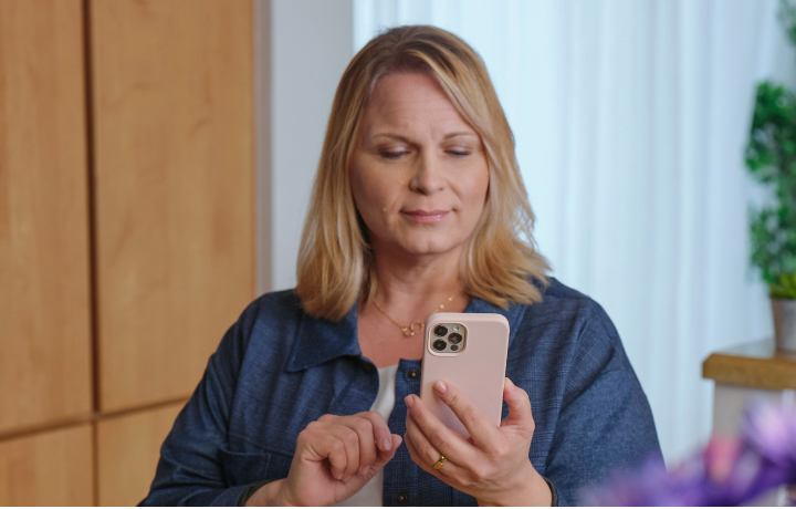
Age: Focus more on one's life stage than on their numerical age (e.g. show parents and caregivers from a range of age cohorts, show older individuals in the workplace and using technology).
Gender and gender identity: Show the full spectrum of gender identity, show diversity in gender roles and avoid gender stereotypes (e.g. show men as caregivers and nurses, and women in leadership).
Family configurations: Show different family configurations (e.g. single parents, same-sex parents, families without children, multigenerational and caregivers).
Abilities: Show people across the full spectrum of ability, both visible and invisible, in empowered and active roles; showcase the person, not the disability.
Body types and appearance: Show people of all difference shapes, sizes, and individual characteristics (e.g. eye color, wrinkles, blemishes, hair color and texture, etc.) and consider the context that the image will be used in (e.g. if the image will be used for an Orthopedic campaign how might that change the person's appearance?).
Beliefs: Respectfully show different cultural and religious practices, traditions and wardrobes.
Socioeconomic status: Show people from a variety of socioeconomic backgrounds (e.g. income, occupation, and education) in dignified and respectful ways.
Medical empathy: Focus on the connection and humanity of the moment between the clinician and patient, not on the medical condition.
Photography treatments and editing
Photography treatments and editing decisions should always reinforce our photography principles.


User generated content at events
User generated content at events
Capturing athenahealth's presence at internal and industry events is a great opportunity to drive awareness and positive perception of our brand and promote the different audiences we serve.
athenahealth has a presence at hundreds of events each year, making it difficult to have a professional photographer at every event. The marketing department relies on athenistas to help capture photographs and work with the respective teams to promote them on our social or internal communications channels and/or on our careers site.
In addition to the photography guidance outlined in this section, there are a few additional points to take into account when capturing our presence at events. Adhering to them will help ensure that athenahealth is always positioned in a positive and professional way that demonstrates our positioning of curing complexity to simplify the practice of care.
User generated content guidance
Highlight athenahealth: Our logo and branding should be featured prominently and positioned heroically. This may mean taking a close-up of the messaging on a promotional item or handout or capturing the backdrop of the booth. Whatever it may be, try to focus on the strongest brand moments at the booth or event space and don't be afraid to take several shots of different brand moments.
Embrace simplicity to cure complexity: Focus on the essential details in your photos. Eliminate distractions by reducing clutter in the foreground and avoiding busy backgrounds that detract from the main subject. Limiting images to 1-2 people not only simplifies the composition but also highlights moments of genuine connection, ensuring clarity and impact in every shot.
Shoot for the intended use case: Depending on where you'll use your images, a vertical or horizontal oriented image may be needed. Play with scale and take a variety of images - close-ups, engagement shots, etc. - to ensure you're capturing what may be needed.
Consider lighting and equipment: When possible, use natural light and well-lit areas and a professional-grade camera or smartphone with a high-quality camera to capture vibrant, high-quality images. Be sure to clean your lens of any smudges or dirt that could affect the image quality.
Filters, special effects and editing: Our photography should feel authentic and natural. Avoid filters, special effects or editing that may distort the original intent or look and feel of the event.
Consider the impact on your personal brand: These images are not only a reflection of athenahealth but on you and anyone else featured. Ask yourself if you'd be proud to share these images on your our own social networks.
Capturing headshot portraiture
Capturing headshot portraiture
Headshot portraiture
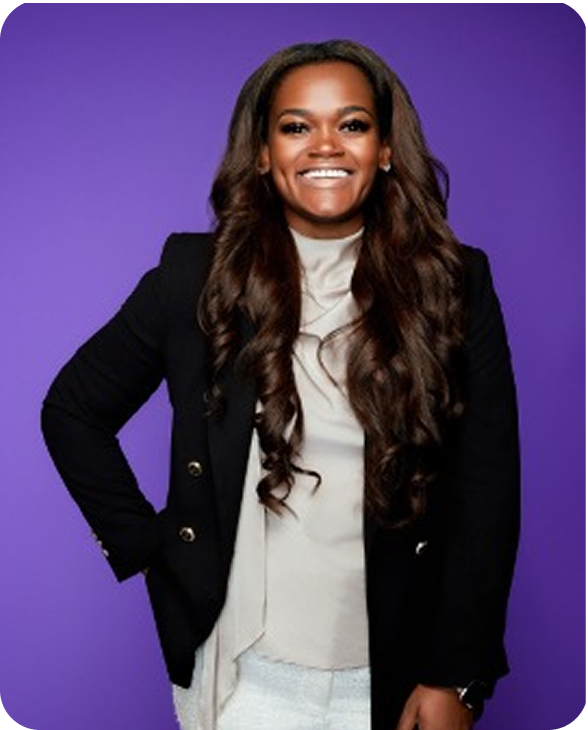
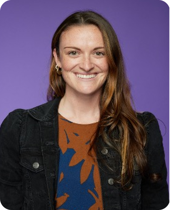
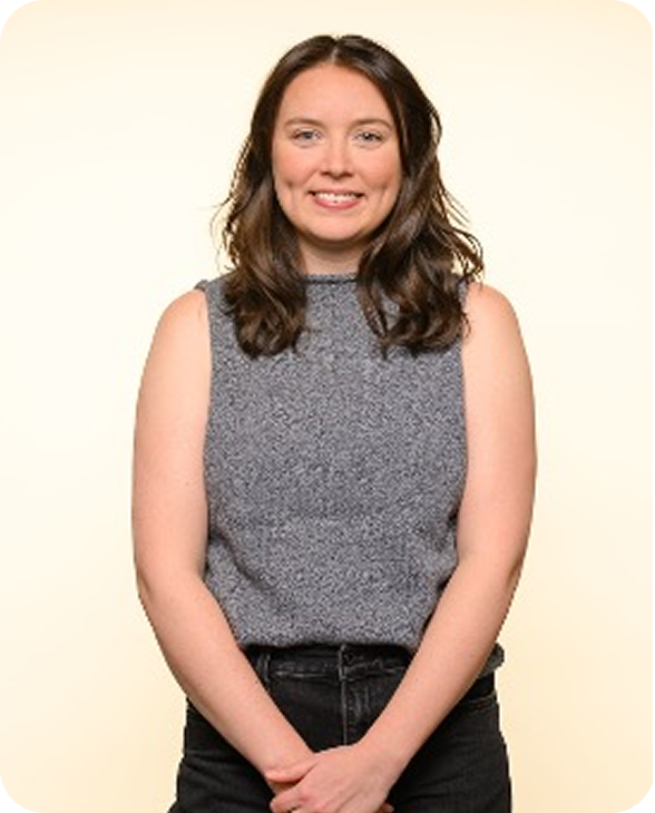
Headshot studio portraiture features a subject standing from the waist up. Imagery should feel clean and crisp with natural shadows. Whenever possible, headshots should be captured by a professional photographer and use our hero purple or cream backdrop. Color within clothing, accessories or makeup should not draw attention away from the individual or become distracting. Any retouching should be light/minimal.
Photographer recommendations
- Camera: Canon R5 paired with Profoto lighting (500W/1000W) or similar
- Lens: A fast 85mm or 50mm lens (f1.4 or f2.8) or 35mm lens in very tight spaces
- Backdrop lighting: Two 4-foot strip lights positioned about 5 feet away at a 45-degree angle
- Key light: 3-foot gridded Chimera Silver Octa, placed 12 feet behind the subject with a 5-foot umbrella directly behind it to help diffuse and soften the light
- Backdrop: Our preferred ways to bring hero purple and cream to life is to use Savage Widetone Background Paper #62 Purple and Savage #51 Bone Seamless Background Paper.
Example set up with bounce and key camera right

Headshot portraiture considerations
Headshot portraiture considerations
Background color
A solid hero purple or cream backdrop should be used whenever possible to help the subject stand out and for consistency.
Composition
To ensure the focus is on the subject as a headshot, the preference is for the subject to be shot slightly angled to camera, standing in a position that feels comfortable, from the waist up. This also allows for tighter cropping as needed in post-production.
Expression
The subject should look directly at the camera and have a friendly and positive facial expression that feels inviting. Overall the photo should feel natural and authentic to the person being photographed.



Submitting personal headshots
For individuals submitting their own headshots to be used by athenahealth for internal and/or external usage, please follow this guidances:
- Use a waist or chest-up photo; avoid full-body shots or images that only show your head.
- Choose a recent photo taken within the last five years.
- Select a simple background, steering clear of busy patterns or distracting scenery.
- Ensure the photo features only you; avoid including other people in the background or cropping them out.
- Keep your appearance simple, professional, and authentic and avoid clothing with distracting patterns or colors.
- Minimal retouching is acceptable, but don't go overboard.
- Ensure the photo resolution is at least 300 pixels per inch (PPI) to prevent pixelation or blurriness.
- Be true to yourself; avoid using AI-generated or altered images.
Additional considerations
Additional considerations for brand photoshoots
In today's content-driven world, it's critical to capture images that work across a variety of platforms and formats.
Both landscape and vertical orientations should be shot to ensure compatibility with everything from widescreen presentations to social media stories. Additionally, shot coverage should follow this structured approach:
Embrace simplicity to cure complexity: Focus on the essential details in your photos. Eliminate distractions by reducing clutter in the foreground and avoiding busy backgrounds that detract from the main subject. Limiting images to 1-2 people not only simplifies the composition but also highlights moments of genuine connection, ensuring clarity and impact in every shot.
Wide Shots: Establish the environment and context, setting the scene for the story.
Medium Shots: Focus on the main action or interaction, driving the narrative forward.
Close-Ups: Highlight details, whether it's an individual's expression, a device, or a featured product. These tighter shots add depth and texture to the visual story, drawing attention to important elements.
By following this approach, the shoots will deliver a comprehensive library of imagery that's versatile, brand-aligned, and ready for multiple applications.