Intro
The athenahealth logos are our most identifiable assets, we use them with confidence and intention.
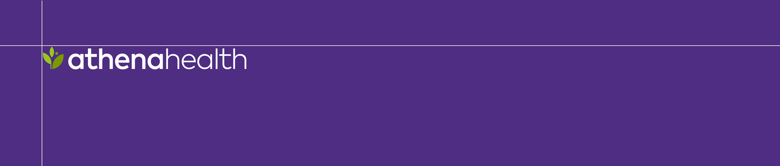
The athenahealth logo
The following pages lay out the four approved variations of our logo and correct usage guidelines.
Remember
When written in text, “athenahealth” always uses lowercase with no space between “athena” and “health.”
Logo
Logo
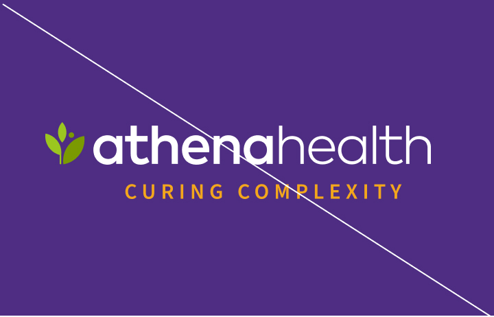
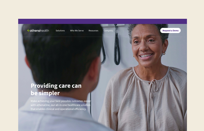
The athenahealth logo is our main identifier and acts as a flexible core brand asset. Used consistently across all brand applications, the athenahealth logo becomes one of our most impactful and instantly recognizable assets, continually reinforcing our brand presence.
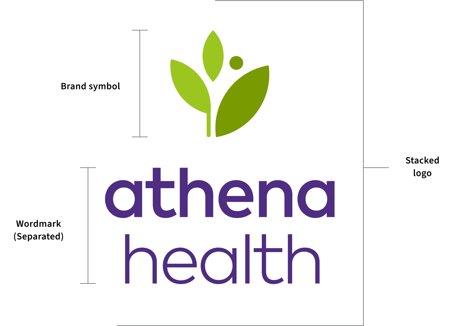
Elements
Logo components
Our logo is a lock up of the athenahealth brand symbol and wordmark.
The athenahealth wordmark is never used on it's own. Brand symbol usage can be found later in this section.
Logo color
The color breakdowns of our logo can be found here.
Note: the greens are reserved for use in our logo and should not be used elsewhere without the brand team's involvement.
Color
Color combinations
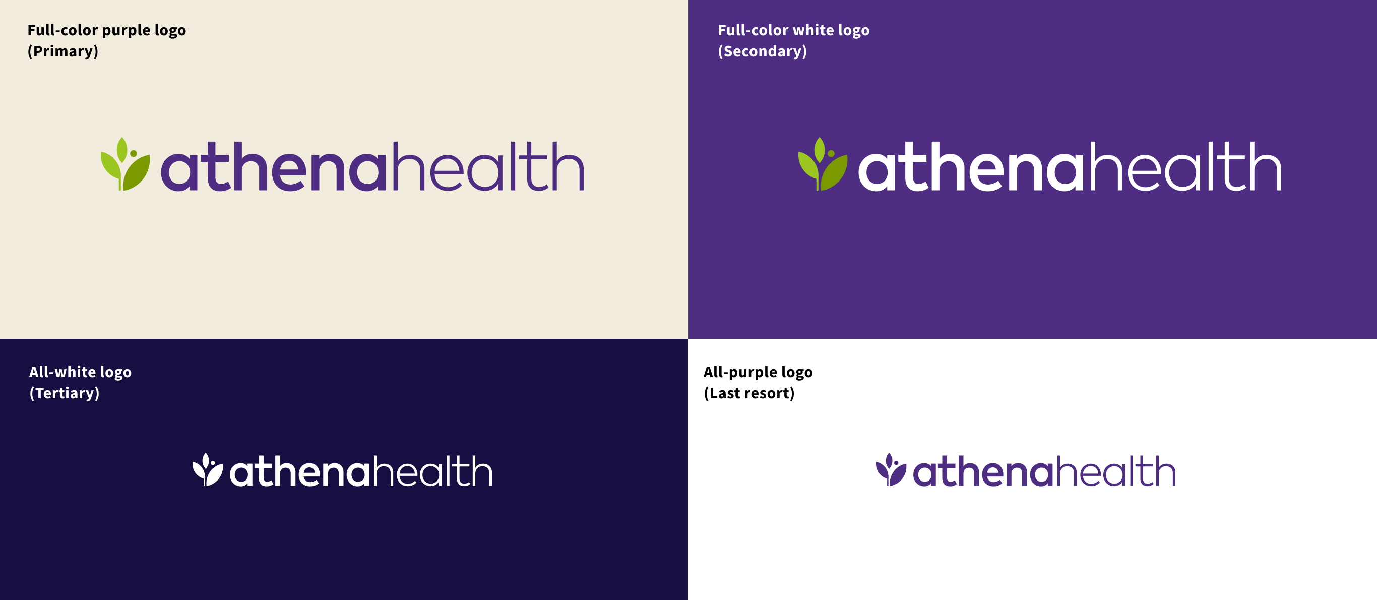
The full-color purple logo is our primary logo. However, there are a few color alternates that can be used depending on the background color.
If there are contrast issues that will make the primary logo illegible then use the full-color white logo. If contrast issues prevent the primary or the secondary options from being legible then use the all-white logo. Only as a last resort should the all-purple logo be used (e.g. a one-color imprint on a light-colored promotional item).
Full-color purple logo
(Primary)
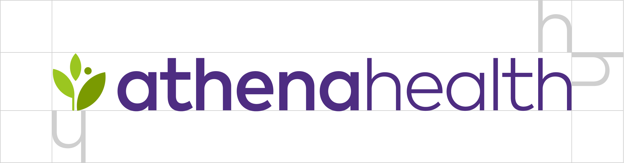
Clearspace
Logo breathing room
Logo clearspace is defined by the height of the 'h' found in the 'health' portion of the wordmark.
It is important to surround our logo with a healthy amount of clearspace so it stands out in our communications. Avoid placing any text (such as URLs) or graphic elements within the designated clearspace. Whenever possible, allow for more clearspace than the minimum requirement.
Sizing
Minimum size
To ensure legibility, never scale the logo smaller than the minimum size recommendation — 12px or .15” high.
While there is no maximum size of our logos, they must always be shown in their entirety and the context of their placement must be considered.
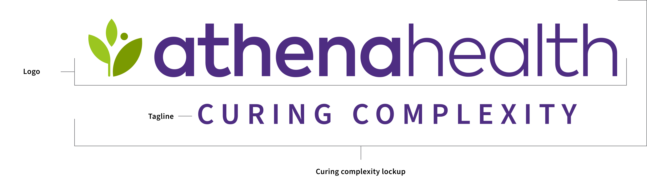
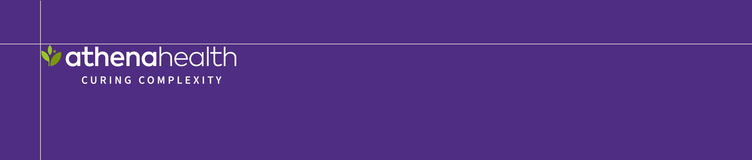
Lockup
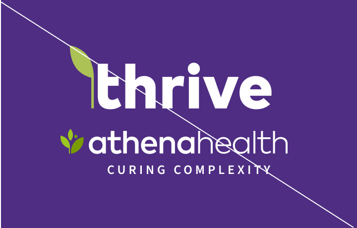
Curing complexity lockup
Lockup
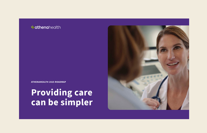
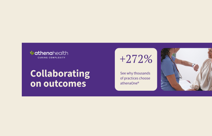
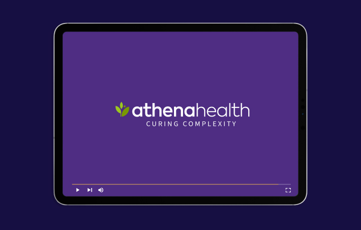
The curing complexity lockup is our preferred logo to use in moments when we wish to elevate our brand positioning. This includes the vast majority of in-market materials such as campaign creative. For applications that have a longer shelf-life and are not focused on telling our brand story, such as service descriptions and internal facing compliance and security trainings, then the primary logo should be used.
In instances where a logo will appear more than once (e.g. direct mail pieces, multi-page documents, presentations, reports, etc.) then the curing complexity lockup should take the lead, appearing on first use, with the primary logo used on subsequent instances/pages.
Lockup components
Elements
Lockup components
The curing complexity lockup is made from combining our primary logo with our tagline, Curing Complexity. Only use the approved artwork. There is no need to recreate or alter any of the lockup's components.
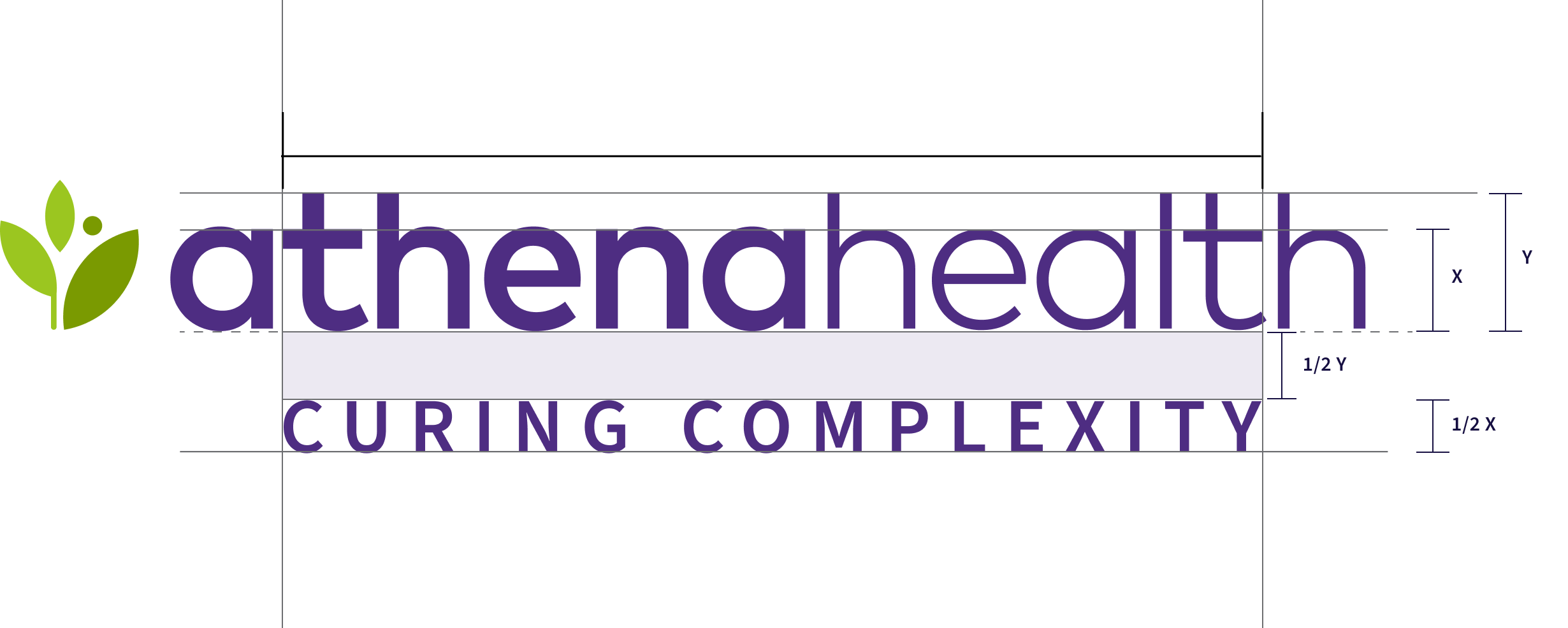
Construction
Construction
The length of our tagline 'CURING COMPLEXITY' extends from the outer left edge of the letter 'C' in 'CURING' to the outer right edge of the 'Y' in 'COMPLEXITY'. It should be equal to the distance between the outer left edge of the 't' in 'athena' and the outer right edge of the 't' in 'health.'
The height of the tagline is half the x-height of the athenahealth wordmark. Spacing from the wordmark is half the height of the letter 'h'.
Color and backgrounds
Color and backgrounds
The full-color purple version is the primary curing complexity lockup. However, there are a few color alternates that can be used depending on the background color.
If there are contrast issues that will make the primary lockup illegible then use the full-color white lockup. If contrast issues prevent the primary or the secondary options from being legible then use the all-white lockup. Only as a last resort should the all-purple lockup be used (e.g. a one-color imprint on a light-colored promotional item).
Full-color purple logo
(Primary)
Lockup clearspace
Lockup breathing room
To ensure legibility, the lockup should never be used below 30px or .45” high.
Lockup clearspace is defined by the height of the 'h' found in the 'health' portion of the wordmark. It is important to surround our lockup with a healthy amount of clearspace so it stands out in our communications. Avoid placing any text (such as URLs) or graphic elements within the designated clearspace. Whenever possible, allow for more clearspace than the minimum requirement.
Lockup sizing
Sizing
To ensure legibility, the lockup should never be used below 30px or .45” high.
While there is no maximum size of the lockup, it must always be shown in its entirety and the context of its placement must be considered.
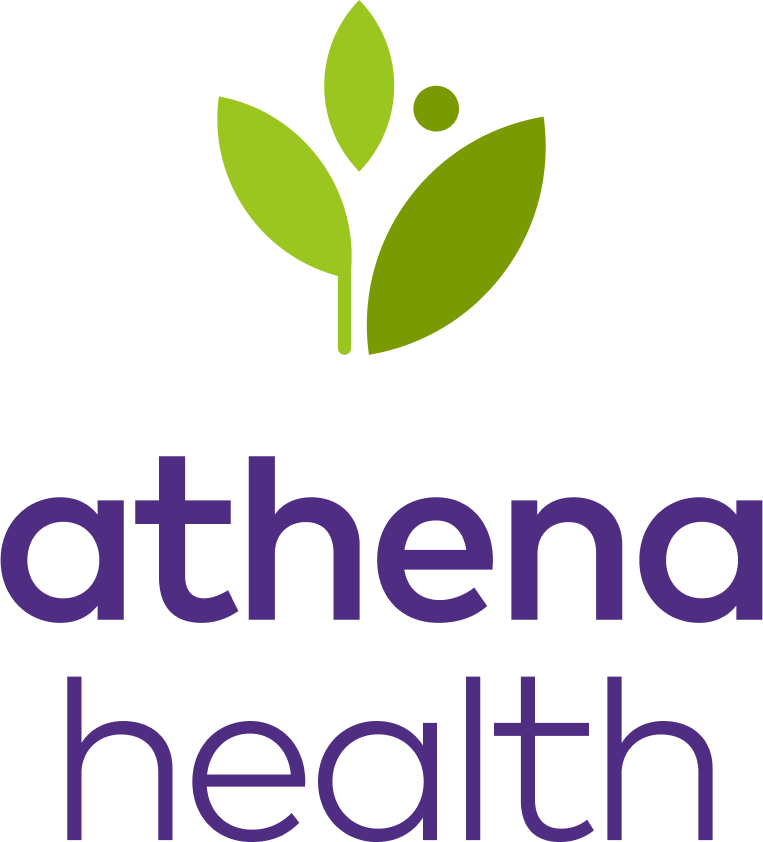
Stacked logo
Vertical logo
Use of the stacked logo is reserved for instances such as social media profile images or other space-constrained applications such as some promotional items.
Any other use of the stacked logo requires explicit brand permission. Reach out to brand@athenahealth.com to determine if your project requires the stacked logo
Stacked logo components
Elements
Stacked logo components
Our stacked logo is a vertical lockup of our brand symbol and the wordmark, that has been separated onto two lines.”
This is the only use case when athenahealth should be separated into two words and this wordmark will never be used on it's own
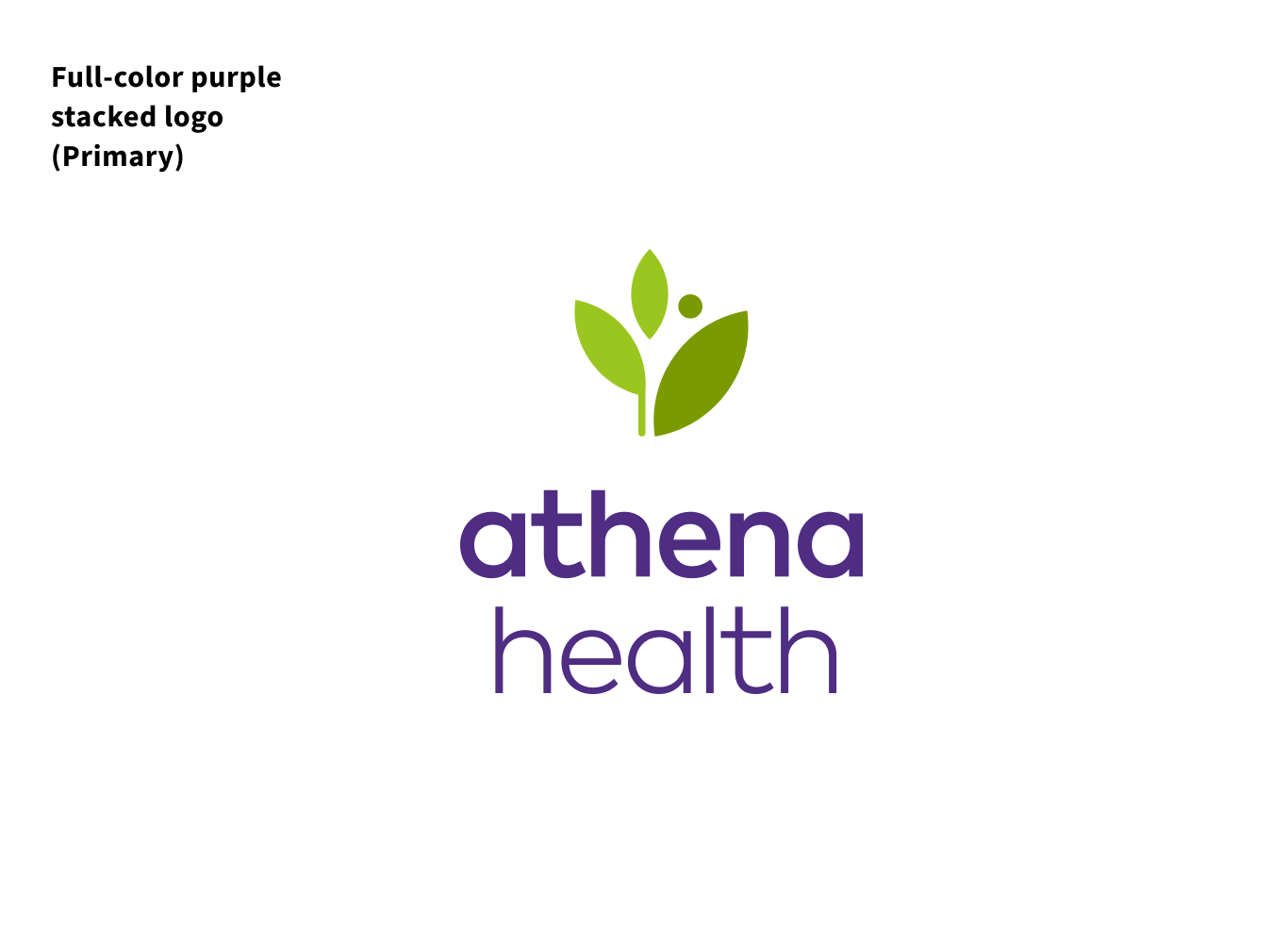
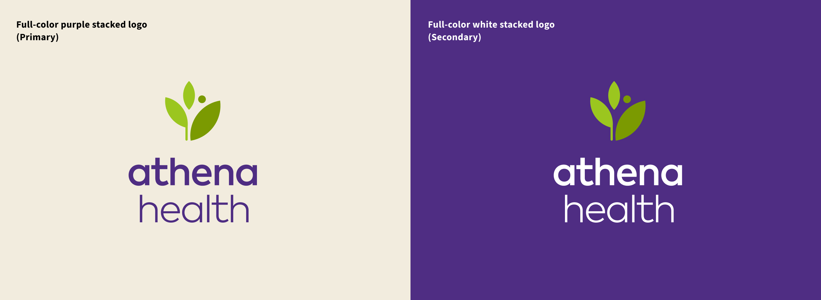
Stacked logo color
Color and backgrounds
The full-color purple is the primary stacked logo option. If there are contrast issues that will make the primary version illegible then the full-color white version should be used.
Stacked logo sizing
Minimum size
The stacked logo should never be used below 72px or 1” high.
When using the stacked logo it must always be shown in its entirety and the context of its placement must be considered when determining its size.
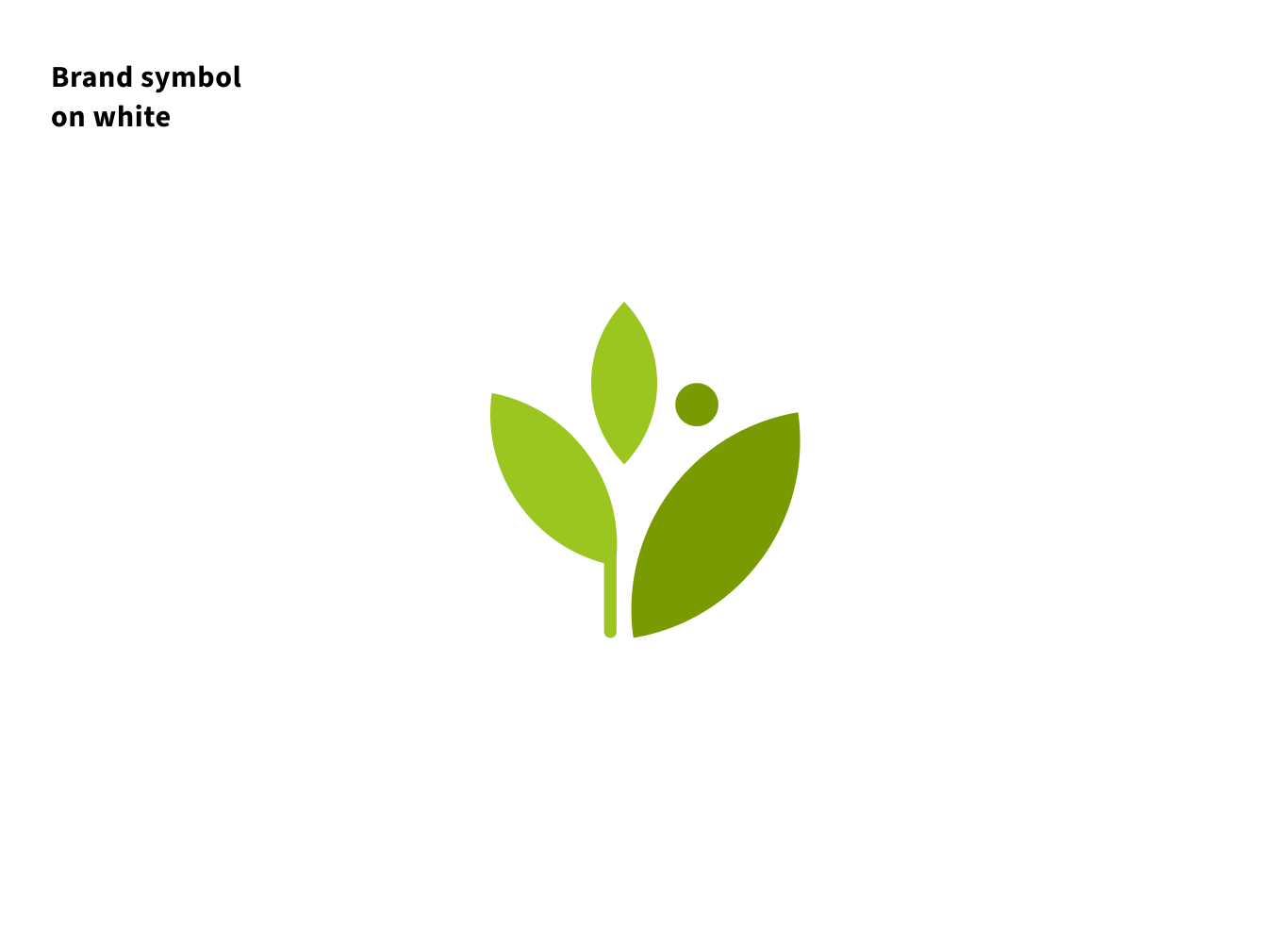
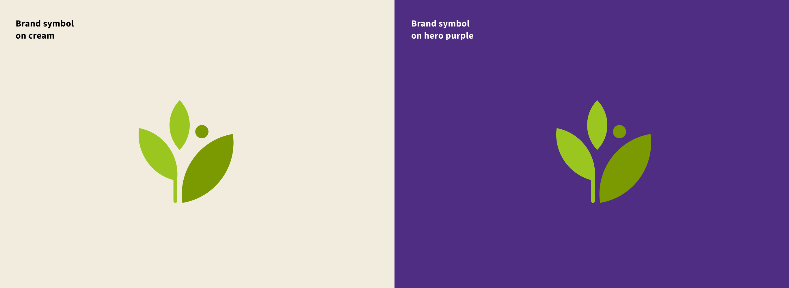
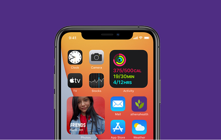
Brand Symbol
Use of the brand symbol is reserved for instances such as social media profile images, app icons, favicons, and in limited cases, promotional items. Any other use of the brand symbol requires explicit brand permission. Questions or alternate use requests of it should be directed to the athenahealth brand team.
The brand symbol should only ever be used on white, cream or hero purple backgrounds.
Logo usage
Logo placement
The preferred placement of our logos is in the top-left corner with equal margins to the top and left.
There will be times where the overall hierarchy and context of a piece or experience will warrant a different placement (e.g. the end card of a video or the footer of a presentation or document) but these are the exception and not the rule.
Additionally, always follow the placement and guidance found in the templates available on this site.
Improper use of our logos
Logo Alignment
Aligning text & objects
When aligning text or objects to our logo always align the left edge of the text or object to the left edge of the logo leaf.
Never use the text of the logo for alignment purposes.
Text
Photography
Improper use of our logos
Improper use of our logos
The examples on this page show what NOT to do with the athenahealth logos.
Our logos and individual logo components should never be altered. Always use the approved logos provided on this site.
How to use our logos
Proper use of our logos
How to use our logos
Both our logo and curing complexity lockup can be used as an immediate identifier of athenahealth.
The primary logo acts best on websites and email headers, documents with lots of text such as word documents and one pagers, and overly busy applications such as powerpoint slides.
The lockup should be used for both print and digital marketing materials and adds depth to video and event applications.
Use of the stacked logo and brand symbol are reserved for small scale applications.
Logo
Curing complexity lockup
Stacked logo & Brand symbol