Intro
Used intentionally, color helps us tell clear, confident stories and draw brand differentiation, setting us apart in the market.
Primary & secondary palettes
Our palette consists of our primary palette and our secondary palette. Both will play integral and intentional roles in the athenahealth brand system.
Hero purple
Our primary color is Hero purple. Purple is distinct. It sets us apart, and it's the first thing you think of when you think athenahealth.
Hero purple is our primary color, but it doesn't always need to dominate. It should be used meaningfully - as a header or background in a piece of content, to add a pop of color in photography or to intentionally callout key content in a presentation.
Hero purple will lead for big brand centered applications—events, marketing materials, brand introductions, but may take on a more secondary role for executions such as email or secondary website pages.
Hero Purple
Web Hex #4E2D82
RGB 78 | 45 | 130
Print PMS 2091 C
CMYK 91 | 100 | 0 | 0
Primary palette
Primary palette
Our primary palette allows for consistent brand applications and helps distinguish us in the market.
In addition to hero purple our primary palette consists of cream, white, honey and midnight. Cream and white play a larger role in our communications as neutrals and together with Hero Purple, are our preferred background colors.
Midnight acts as an anchor for the other colors in our palette and can, in limited uses, be used as a background color.
Honey should be used sparingly to grab attention as CTAs and callouts and should never be used as a background color.
Hero purple
Web Hex #4E2D82
RGB 78 | 45 | 130
Print PMS 2091 C
CMYK 91 | 100 | 0 | 0
Cream
Web Hex #F2ECDE
RGB 242 | 236 | 222
Print PMS 9224 C
CMYK 4 | 5 | 12 | 0
Honey
Web Hex #F3A61C
RGB 243 | 166 | 28
Print PMS 130 C
CMYK 3 | 39 | 100 | 0
White
Web Hex #FFFFFF
RGB 255 | 255 | 255
Print CMYK 0 | 0 | 0 | 0
Midnight
Web Hex #160F41
RGB 22 | 15 | 65
Print PMS 275 C
CMYK 100 | 100 | 35 | 50
Secondary palette
Secondary palette
Our secondary palette consists of forge blue, lite purple, orchid, peacock, amd lime green. These colors complement the primary palette and are used to strengthen visual connections.
They can be used in data visualization, or to identify themes at our events. Secondary color should never be used as copy or background colors. For uses of the secondary palette outside of data visualization or events, please consult the athenahealth brand team.
Forge blue
Hex #0466B4
RGB 4 | 102 | 180
PMS 300 C
CMYK 91 | 61 | 0 | 0
Lite purple
Hex #9C28B1
RGB 156 | 40 | 177
PMS 2592 C
CMYK: 50 | 90 | 0 | 0
Orchid
Hex #B4005B
RGB 180 | 0 | 91
PMS 215 C
CMYK: 25 | 100 | 43 | 6
Peacock
Hex #23A1BE
RGB 35 | 161 | 190
PMS 3125 C
CMYK: 76 | 18 | 20 | 0
Lime green
Hex #589C48
RGB 88 | 156 | 72
PMS 3501 C
CMYK: 71 | 17 | 96 | 3
Proportions
Regardless of whether your use case requires the use of only the primary color palette or the full color palette, hero purple, cream and/or white should always play the lead role. In the primary palette, honey & midnight act as support colors. When using the secondary palette, the secondary colors should never overpower the core primary colors in use.
While not all colors will be used in all applications, the use of similar amounts of leading and supporting colors will allow for consistency throughout our brand communications—creating unity across our website, external communications, and evergreen brand creative.
Primary palette
Secondary palette
Improper use
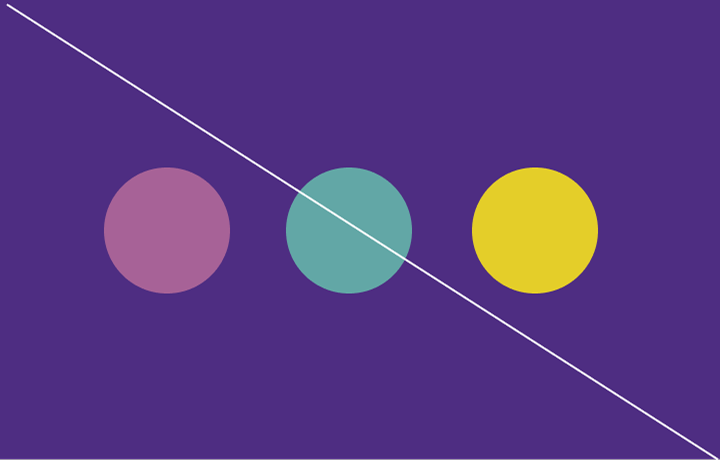
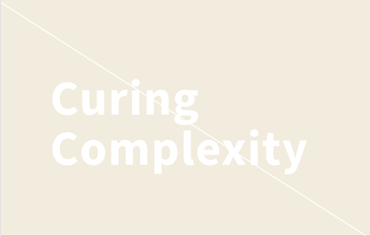
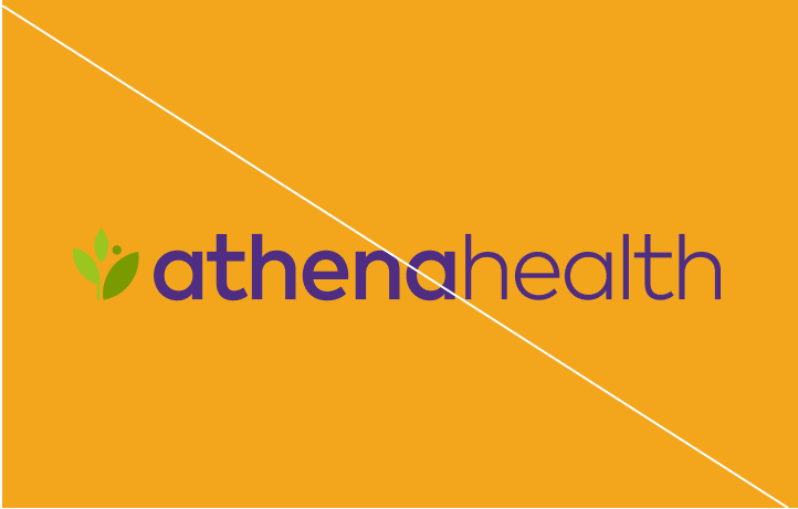
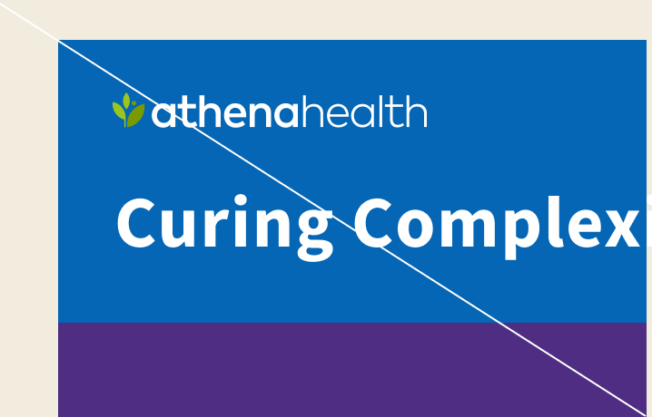
Improper use of color
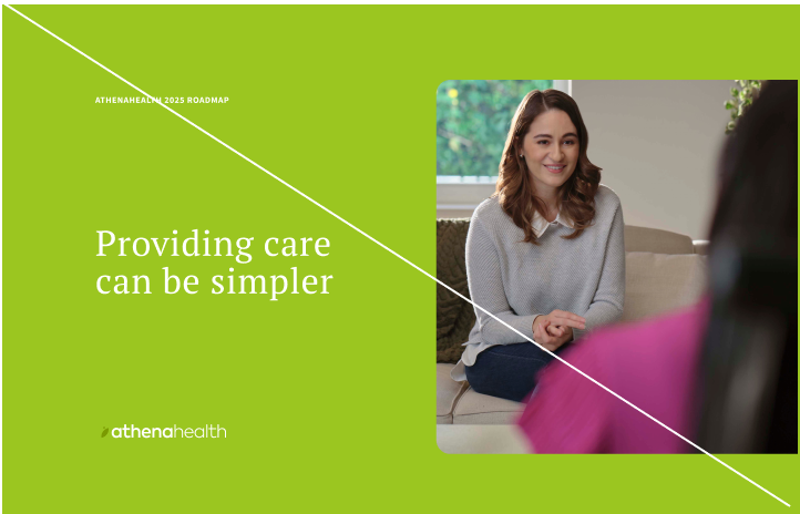
The examples on this page show how NOT to apply our color palettes.
Avoiding these improper uses will help the athenahealth brand maintain consistency across all applications.



Tints
Color saturation
In some cases we will use tinted shades of our palettes. The primary use of these tints will be powerpoint presentations, data visualization, icons and web elements.
Midnight
Hex: 160F41
RGB: 22 | 15 | 65
CMYK: 100 | 100 | 35 | 50
PMS: 275 C
Hero Purple 100
Hex: 4E2D82
RGB: 78 | 45 | 130
CMYK: 91 | 100 | 0 | 0
PMS: 2091 C
Purple Int 70
Hex: 916DCB
RGB: 145 | 109 | 203
CMYK: 54 | 51 | 0 | 0
PMS: 2101 CP
Purple Int 50
Hex: B097D2
RGB: 176 | 151 | 217
CMYK: 37 | 35 | 0 | 0
Purple Int 30
Hex: D0C1E9
RGB: 208 | 193 | 233
CMYK: 21 | 21 | 0 | 0
Purple Int 15
Hex: E7E0F4
RGB: 231 | 224 | 244
CMYK: 12 | 11 | 1 | 0
Purple Int 10
Hex: EFEAF7
RGB: 239 | 234 | 247
CMYK: 8 | 7 | 1 | 0
Lite Purple 100
Hex: 9C28B1
RGB: 156 | 40 | 177
CMYK: 50 | 90 | 0 | 0
PMS: 2592 C
Lite Int 70
Hex: BA69C8
RGB: 186 | 105 | 200
CMYK: 37 | 56 | 0 | 0
PMS: 6079 CP
Lite Int 50
Hex: CD93D8
RGB: 205 | 147 | 216
CMYK: 26 | 40 | 0 | 0
Lite Int 30
Hex: E1BFE8
RGB: 225 | 191 | 232
CMYK: 16 | 24 | 0 | 0
Lite Int 15
Hex: F0DFF3
RGB: 240 | 223 | 243
CMYK: 9 | 12 | 1 | 0
Orchid 100
Hex: B4005B
RGB: 180 | 0 | 91
CMYK: 25 | 100 | 43 | 6
PMS: 215 C
Orchid Int 70
Hex: E85CA3
RGB: 232 | 92 | 163
CMYK: 8 | 70 | 3 | 0
PMS: 2038 CP
Orchid Int 50
Hex: EE8ABD
RGB: 238 | 138 | 189
CMYK: 8 | 50 | 2 | 0
Orchid Int 30
Hex: F5B9D8
RGB: 245 | 185 | 216
CMYK: 7 | 30 | 1 | 0
Orchid Int 15
Hex: FADCEB
RGB: 250 | 220 | 235
CMYK: 5 | 15 | 1 | 0
Peacock 100
Hex: 23A1BE
RGB: 35 | 161 | 190
CMYK: 76 | 18 | 20 | 0
PMS: 3125 C
Peacock Int 70
Hex: 8CCDDD
RGB: 140 | 205 | 221
CMYK: 41 | 3 | 5 | 0
PMS: 2197 CP
Peacock Int 50
Hex: ACDBE6
RGB: 172 | 219 | 230
CMYK: 30 | 2 | 5 | 0
Peacock Int 30
Hex: CEE9F0
RGB: 206 | 233 | 240
CMYK: 18 | 4 | 4 | 0
Peacock Int 15
Hex: E6F4F8
RGB: 230 | 244 | 248
CMYK: 9 | 3 | 2 | 0
Lime 100
Hex: 589C48
RGB: 88 | 156 | 72
CMYK: 71 | 17 | 96 | 3
PMS: 3501 C
Lime Int 70
Hex: 89BB80
RGB: 137 | 187 | 128
CMYK: 46 | 5 | 58 | 1
PMS: 2261 CP
Lime Int 50
Hex: A8CDA2
RGB: 168 | 205 | 162
CMYK: 33 | 4 | 39 | 0
Lime Int 30
Hex: CCE2C9
RGB: 204 | 226 | 201
CMYK: 19 | 3 | 20 | 0
Lime Int 15
Hex: E6F1E4
RGB: 230 | 241 | 228
CMYK: 9 | 2 | 8 | 0
Honey 100
Hex: F3A61C
RGB: 243 | 166 | 28
CMYK: 3 | 39 | 100 | 0
PMS: 130 C
Honey Int 70
Hex: F8C261
RGB: 248 | 194 | 97
CMYK: 2 | 22 | 68 | 1
PMS: 141 CP
Honey Int 50
Hex: F9D38E
RGB: 249 | 211 | 142
CMYK: 3 | 15 | 45 | 0
Honey Int 30
Hex: FCE5BB
RGB: 252 | 229 | 187
CMYK: 3 | 8 | 25 | 0
Honey Int 15
Hex: FEF2DD
RGB: 254 | 242 | 221
CMYK: 2 | 4 | 11 | 0
Forge 100
Hex: 0466B4
RGB: 4 | 102 | 180
CMYK: 91 | 61 | 0 | 0
PMS: 300 C
Forge Int 70
Hex: 50A3E4
RGB: 80 | 163 | 228
CMYK: 57 | 23 | 0 | 0
PMS: 2191 CP
Forge Int 50
Hex: 82BDEC
RGB: 130 | 189 | 236
CMYK: 43 | 14 | 1 | 0
Forge Int 30
Hex: B4D7F4
RGB: 180 | 215 | 244
CMYK: 27 | 7 | 0 | 0
Forge Int 15
Hex: DAEBF9
RGB: 218 | 235 | 249
CMYK: 14 | 5 | 2 | 0
Cream 100
Hex: F2ECDE
RGB: 242 | 236 | 222
CMYK: 4 | 5 | 12 | 0 PMS: 9224 C
Cream 70
Hex: F7F3E9
RGB: 247 | 243 | 233
CMYK: 3 | 3 | 6 | 0
Cream 50
Hex: F8F6EE
RGB: 248 | 246 | 238
CMYK: 3 | 2 | 5 | 0
Cream 30
Hex: FCFAF5
RGB: 252 | 250 | 245
CMYK: 1 | 1 | 3 | 0
Cream 15
Hex: FEFDFB
RGB: 254 | 253 | 251
CMYK: 1 | 0 | 1 | 0
Black
Hex: 000000
RGB: 0 | 0 | 0
CMYK: 60 | 40 | 40 | 100
PMS: Black 6 CP
Dark Gray
Hex: 212529
RGB: 33 | 37 | 41
CMYK: 83 | 73 | 62 | 55
PMS: Black 3 CP
Gray 100
Hex: 6D6E6F
RGB: 109 | 110 | 111
CMYK: 58 | 49 | 48 | 15
PMS: 2334 CP
Gray 70
Hex: 9A9B9B
RGB: 154 | 155 | 155
CMYK: 39 | 31 | 28 | 0 PMS: Cool Gray 7 CP
Gray 50
Hex: B5B6B7
RGB: 181 | 182 | 183
CMYK: 27 | 20 | 17 | 0
Gray 30
Hex: D4D4D5
RGB: 212 | 212 | 213
CMYK: 15 | 10 | 8 | 0
Gray 15
Hex: E9E9EA
RGB: 233 | 233 | 234
CMYK: 7 | 5 | 3 | 0
Gray 10
Hex: F0F0F0
RGB: 240 | 240 | 240
CMYK: 4 | 3 | 2 | 0
Disabled Gray
Hex: D8D8D8
RGB: 216 | 216 | 216
CMYK: 13 | 9 | 7 | 0
Combinations
Approved copy & background combinations
The background and copy color combinations on this slides are our approved color combinations and have been designed to ensure accessibility and legibility for our audiences. These combinations pass all web color accessibility thresholds.
White on
Hero purple
Hero purple
on White
Hero purple
on Cream
Cream on
Hero purple
Midnight
on White
Midnight
on Cream
Honey on
Hero purple
Gradient
Gradient usage
Our approved gradients can be found on this page. Used sparingly gradients can help add delight and visual interest to an experience. They can be used to help create space to provide messaging or add a visual pop.
Gradients are reserved for digital, experiential/interactive components such as websites, interactive displays, events screens and reserved for limited use cases within PowerPoint templates.
Gradients should never be used within letterforms of typography.
Midnight to Hero Purple
Hex: 160F41
to
Hex: 4E2D82
Hero Purple to Purple Int 50
Hex: 4E2D82
to
Hex: B097D2
Midnight to Purple Int 50
Hex: 160F41
to
Hex: B097D2