Intro
Our icons help us tell the athenahealth story in highly functional and concise ways.
Our icon system
Icons are small, simple and self-explanatory graphics designed for repetitive use to help audiences quickly navigate specific pieces of information.
We have a full library that includes two different sets of icons for different uses.
Note: Any new icons must be approved by athenahealth brand team.
Two sets working in tandem
Two sets working in tandem
Two overarching principles give our icons a unique and proprietary look and feel, while ensuring continuity across all of our communications.

Used as a decorative element within a callout or section, or as a navigational signpost in marketing and product design.

Used for functional communications such as addressing specific audience, touchpoint, or messaging needs.
Guiding icons
Our guiding icons are used to create a cohesive visual language across different audiences and contexts.
Their distinctive design and color make them recognizably us. The curved edges in their construction tie back into the athenahealth logo curvature and our brand holding shape.
Scale and use of guiding icons
Scale and use of our guiding icons
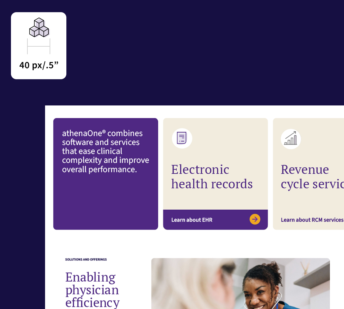
Guiding icons are best used at slightly larger scale due to their level of detail. The minimum size at which guiding icons should be used is 40px or .5”. At this scale, they perform well in digital applications where they play the role of indicator or section divider.
Guiding icons should never be used larger than 100px or 1.25”. When used large, they make a nice graphic element that can be applied to ads or presentations.
Note: Guiding icons should always be used on a white background.


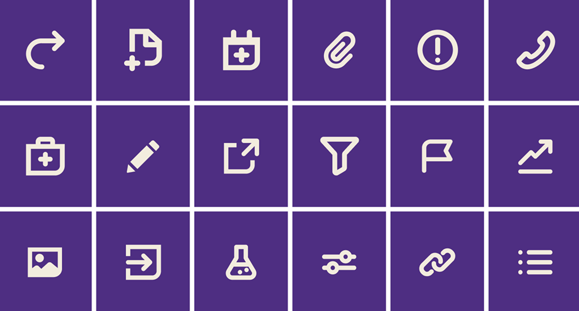
Functional icons
To provide flexibility in addressing specific audience, touchpoint, or messaging needs, we use this family of functional icons. Functional icons are used at relatively small sizes for very specific calls to action.
Scale and use of functional icons
Scale and use of functional icons
Our functional icons are meant to be used at very small scales, where the detail of our guiding icons would be indistinguishable. They will always be pointing a user to a functional task.
The smallest our functional icons should be used is 15px or .2” and the largest they should be used is 30px or .4”. If there is room for a larger icon, a guiding icon should be used.


Improper use
Improper use of our icons
The examples on this page show what NOT to do with both guiding and functional icons.


Proper use
How to use our icons
The examples on this page show how to properly use our icons.

